
 cman.jp > WEBページ作成TOP > CSSリファレンス > 「横幅」
WEBページ作成
広告
width「横幅」
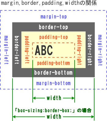
widthは要素の横幅を指定します。通常はmargin,padding,boderを含まない要素の横幅となりますが、box-sizingの指定によりpaddingやborderを含んだ横幅に指定することも出来ます。
| CSS Ver. | 適用要素 | 継承 |
|---|---|---|
| 2.1 | 全て | しない |
広告
widthの指定方法
| 構文 | |
|---|---|
|
width : 値 | auto ; |
|
| プロパティ/設定値 | 意味 |
|
width: 100px; width: 80%; width: 20em; |
要素の幅を値で指定 「長さ・大きさの単位」参照 |
| width: auto; | ブラウザに委ねる 「width:100%」とは意味が異なる |
| デフォルト:「タグ毎のスタイル初期値」を参照 | |
width のサンプル
<style type="text/css">
/* ----- サンプル1 --------------- */
.boxsizing1{
  width      : 210px;
  height      : 110px;
  border      : 10px solid royalblue;
  margin      : 10px;
  padding     : 15px;
}

/* ----- サンプル2 --------------- */
.boxsizing2{
  box-sizing : border-box;
  width      : 210px;
  height      : 110px;
  border      : 10px solid royalblue;
  margin      : 10px;
  padding     : 15px;
}

<!-- html -->
<div class="boxsizing1">
■content-boxサンプル■<br>width:210px;<br>height:110px;<br>box-sizingの指定なし
</div>

<div class="boxsizing2">
■border-boxサンプル■<br>width:210px;<br>height:110px;<br>box-sizing:border-box;
</div>
■content-boxサンプル■
width:210px;
height:110px;
box-sizingの指定なし
width:210px;
height:110px;
box-sizingの指定なし
content-boxの場合
【実際の幅】
260px
= width:210px+(padding:15px×2)+(border:10px×2)
マージンも含めると280pxとなる
【実際の高さ】
160px
= width:110px+(padding:15px×2)+(border:10px×2)
マージンも含めると180pxとなる
■border-boxサンプル■
width:210px;
height:110px;
box-sizing:border-box;
width:210px;
height:110px;
box-sizing:border-box;
border-boxの場合
【実際の幅】
width:210px
マージンも含めると230pxとなる
【実際の高さ】
width:110px
マージンも含めると130pxとなる
width:100% とwidth:auto の違い
<style type="text/css">
/* ----- 親要素 ---------- */
.oya1{
  box-sizing : border-box;
  border     : solid 1px #fff;
  width      : 200px;
  height     : 130px;
  background-color:lightblue;
}
/* ----- サンプル1 --------------- */
.widthauto1{
  width : 100%;
  height : 110px;
  border : 10px solid royalblue;
  margin : 10px;
  padding: 15px;
}
/* ----- サンプル2 --------------- */
.widthauto2{
  width : auto;
  height : 110px;
  border : 10px solid royalblue;
  margin : 10px;
  padding: 15px;
}

<!-- html -->
<div class="oya1">  <!-- 親要素 -->
  <div class="widthauto1">
    ■sample2-1■<br>width:100%;<br>height:110px;
  </div>
</div>

<div class="oya1">  <!-- 親要素 -->
  <div class="widthauto2">
    ■sample2-2■<br>width:auto;<br>height:110px;
  </div>
</div>

<div class="oya1">  <!-- 親要素 -->
  <table class="widthauto1">
    <tr>
      <td>
        ■sample2-3■<br>width:100%;<br>height:110px;
      </td>
    </tr>
  </table>
</div>

<div class="oya1">  <!-- 親要素 -->
  <table class="widthauto2">
    <tr>
      <td>
        ■sample2-4■<br>width:250px;<br>height:110px;
      </td>
    </tr>
  </table>
</div>
■sample2-1■
width:100%;
height:110px;
width:100%;
height:110px;
ブロック要素でwidth:100%の場合
【実際の幅】
250px
= 親要素の幅(width:200px)
+(padding:15px×2)
+(border:10px×2)
■sample2-2■
width:auto;
height:110px;
width:auto;
height:110px;
ブロック要素でwidth:autoの場合
【実際の幅】
180px
= 親要素の幅(width:200px)-(margin:10px×2)
|
■sample2-3■ width:100%; height:110px; |
TABLE要素でwidth:100%の場合
【実際の幅】
200px
= 親要素の幅(width:200px)
|
■sample2-4■ width:250px; height:110px; |
TABLE要素でwidth:autoの場合
【実際の幅】
約160px
= <td>内の文字幅
+(padding:15px×2)
+(border:10px×2)
| 関連するCSS(STYLE) | |
|---|---|
| border-bottom-width | 罫線の底辺の太さ設定 |
| border-image-width | 画像ボーダーの太さ |
| border-left-width | 罫線の左辺の太さ設定 |
| border-right-width | 罫線の右辺の太さ設定 |
| border-top-width | 罫線の上辺の太さ設定 |
| border-width | 罫線の太さ設定 |
| column-rule-width | マルチカラムの区切り線の太さ |
| column-width | マルチカラムのカラムの横幅 |
| max-width | 横幅の最大値 |
| min-width | 横幅の最小値 |
| outline-width | アウトラインの太さ |
広告