
 cman.jp > WEBページ作成TOP > CSSリファレンス > 「」
WEBページ作成
広告
flex-wrap「flexアイテムの折り返し方法」
flexbox(Flexible Box Layout Model)はCSS3で導入されたレイアウトモードです。
flexboxの機能一覧
「flex-wrap」は、flexbox(flexコンテナ内のflexアイテム)の横または縦の折り返し方法を指定します。
| CSS Ver. | 適用要素 | 継承 |
|---|---|---|
| 3.0 | - | 不可 |
広告
flex-wrapの指定方法
| 構文 | ||
|---|---|---|
|
display : flex; |
||
| プロパティ | 設定値 | 意味 |
|
flex-wrap: 値 |
nowrap | flexアイテムを折り返さない(デフォルト) |
| wrap | flexアイテムを折り返す(左から右) | |
| wrap-reverse | flexアイテムを折り返す(右から左) | |
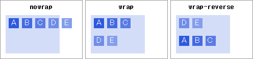 | ||
flex-wrap のサンプル
<style type="text/css">
/* ----- flexコンテナ ----- */
.flexbox1{
  display : -webkit-box;     /* old Android */
  display : -webkit-flex;    /* Safari etc. */
  display : -ms-flexbox;     /* IE10        */
  display : flex;

  background: #d4ddf8;
  width     : 130px;
  height    : 100px;
  margin    : 10px;
  padding   : 3px;
}

/* ----- 折り返さない ----- */
#id1 {
  -webkit-flex-wrap: nowrap;        /* Safari etc. */
  -ms-flex-wrap    : nowrap;        /* IE10        */
  flex-wrap        : nowrap;
}
/* ----- 折り返す(左から右) ----- */
#id2 {
  -webkit-flex-wrap: wrap;          /* Safari etc. */
  -ms-flex-wrap    : wrap;          /* IE10        */
  flex-wrap        : wrap;
}
/* ----- 折り返す(右から左) ----- */
#id3 {
  -webkit-flex-wrap: wrap-reverse;  /* Safari etc. */
  -ms-flex-wrap    : wrap-reverse;  /* IE10        */
  flex-wrap        : wrap-reverse;
}

/* ----- flexアイテム ----- */
.flexbox1 > div{
  margin     : 3px;
  min-width  : 30px;
  height     : 20px;
  color      : #fff;
  text-align : center;
  line-height: 1em;
}
.contentArea{
  display   : inline-block;
  width     : 210px;
  text-align: center;
  border    : 1px solid #999;
  margin    : 3px;
  vertical-align:top;
}
.ca{background: #2d59dc;}
.cb{background: #436ae0;}
.cc{background: #597be3;}
.cd{background: #6f8de7;}
.ce{background: #849eeb;}
</style>

<html>

<div class="contentArea">
    <p>【 nowrap 】<br>折り返さない</p>
    <div id="id1" class="flexbox1"><div class="ca">A</div><div class="cb">B</div><div class="cc">C</div><div class="cd">D</div><div class="ce">E</div></div>
</div>

<div class="contentArea">
    <p>【 wrap 】<br>折り返す(左から右)</p>
    <div id="id2" class="flexbox1"><div class="ca">A</div><div class="cb">B</div><div class="cc">C</div><div class="cd">D</div><div class="ce">E</div></div>
</div>

<div class="contentArea">
    <p>【 wrap-reverse 】<br>折り返す(右から左)</p>
    <div id="id3" class="flexbox1"><div class="ca">A</div><div class="cb">B</div><div class="cc">C</div><div class="cd">D</div><div class="ce">E</div></div>
</div>

</html>
【 nowrap 】
折り返さない
A
B
C
D
E
【 wrap 】
折り返す(左から右)
A
B
C
D
E
【 wrap-reverse 】
折り返す(右から左)
A
B
C
D
E
「flex-wrap」はflexboxの機能の一部となります。通常は他の機能と組み合わせて利用されます。
以下にて「flexbox」の機能をご確認ください。
flexboxの機能一覧
ベンダープレフィックスの使用
flexboxはCSS3で定義されています。このため、一部ブラウザによっては正常に動作しません。
対応状況→http://caniuse.com/#search=flex
このため、ベンダーフレックス「-webkit-」「-ms-」を利用した方が対応範囲が広がります。(上記サンプル参照)
| 関連するCSS(STYLE) | |
|---|---|
| align-content | コンテナ内の行の揃え方 |
| align-items | コンテナ内の垂直方向の揃え方 |
| align-self | flexコンテナの垂直(縦)位置を個別に指定 |
| flex | flex-grow,flex-shrink,flex-basisをまとめて指定 |
| flex-basis | flexboxアイテムの幅を調整 |
| flex-direction | flexboxアイテムの配置(縦/横) |
| flex-flow | flex-directionとflex-wrapまとめて指定 |
| flex-grow | flexboxアイテムの自動幅調整(伸ばす) |
| flex-shrink | flexboxアイテムの自動幅調整(縮む) |
| justify-content | コンテナ内の水平方向の揃え方 |
| order | flexコンテナ内の並び順 |
| display | ボックスの種類 |
広告