
 cman.jp > WEBページ作成TOP > CSSリファレンス
WEBページ作成
広告
clip-path 「画像の切り抜き」
画像の切り抜きを指定する場合は「clip-path」を使用します。
矩形、円形、星形など複雑な形で画像の切り抜きが可能です。
CSS2では「clip」で矩形の切り抜きのみでしたが、CSS3では「clip-path」に移行する予定です。
但し、現時点では、未対応のブラウザもあります。Chrome、Operaは、対応済みです。Firefoxは、url()のみ対応済みです。
| CSS Ver. | 適用要素 | 継承 |
|---|---|---|
| 3.0 | 全要素 | しない |
広告
clip-pathの指定方法
| 構文 | ||
|---|---|---|
|
clip-path : clip-source | [basic-shape || geometry-box]; |
||
| プロパティ/設定値 | 意味 | |
| clip-source | SVGの<clitpath>へのURL。 | |
| url(); | url()のカッコ内に<svg>で指定した<clitpath>のIDを指定。 | |
| basic-shape | polygon()やcircle()などの基本シェイプ機能を指定。 | |
| polygon([fill-rule] | x1 y1,x2 y2, ・・・); | ◆多角形の頂点を指定 ・[fill-rule]:塗り潰しの指定。 nonzero=全面(初期値) evenodd=領域が囲まれている線の本数によって塗る・塗らない(白抜き)が切り替わる。奇数の場合、塗り潰す。 ・x1 y1,x2 y2・・・ : 多角形の頂点をx座標、y座標をスペース区切りで指定。 ※多角形の頂点の座標は、ツール(下記)を使用すると簡単に取得できます。 Ex. CSS clip-path maker や、CLIP PATH GENERATOR |
|
| circle(半径 | at 中心点); | ◆円形を指定 ・半径:半径の長さを指定。 ・at 中心点 : 中心の座標をx座標、y座標をスペース区切りで指定。centerは、画像の中心になります。 |
|
| ellipse(横の半径 | 縦の半径 | at 中心点); | ◆楕円形を指定 ・横の半径、縦の半径:半径の長さを横、縦の順にスペース区切りで指定。 ・at 中心点 : 中心の座標をx座標、y座標をスペース区切りで指定。centerは、画像の中心になります。 |
|
| inset(length | round 「border-radius」); | ◆長方形を指定 ・length:画像の端からの距離を1~4個までスペースで区切って指定可能。指定個数の文法は、「margin」と同様。 ・round 「border-radius」 : 角を丸くする場合、指定。「border-radius」の値を指定。 |
|
| geometry-box | basic-shapeと組み合わせて指定すると、basic-shapeでのリファレンスボックスのようになります。※具体的な指定方法は不明です。 | |
| margin-box; | マージンを含めた矩形を指定。 | |
| border-box; | ボーダーラインを含めた矩形を指定。 | |
| padding-box; | パディングを含めた矩形を指定。 | |
| content-box; | パディングの内側。コンテント領域の矩形を指定。 | |
| fill-box; | オブジェクトバウンディングボックスをレファレンスボックスとして使用。 | |
| stroke-box; | ストロークバウンディングボックスをレファレンスボックスとして使用。 | |
| view-box; | 直近のSVGビューポイントを使用。 | |
| デフォルト:「タグ毎のスタイル初期値」を参照 | ||
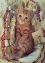
clip-path のサンプル
<style type="text/css">
.common div{
  font-family   : "メイリオ", sans-serif;
  width         : 290px;
  border        : 2px solid #6495ed;
  background    : #e7e7ff;
  padding       : 10px;
}
div.cssTitle {
  margin-top    : 10px;
  background    : #6495ed;
  color         : #fff;
  font-weight   : bold;
}
img{
  clip-path : url(#cross);
}
.sample-circle{
  clip-path : circle(75px at center);
}
.sample-polygon{
  clip-path : polygon(75px 0px, 30px 150px, 150px 60px, 0px 60px, 120px 150px);
}
.sample-polygon2{
  clip-path : polygon(50% 0%, 0% 100%, 100% 100%);
}

<!-- html -->
<div class="common">
  <div class="cssTitle">circle(75px at center);</div>
  <div>
  <img src="clippath.gif" class="sample-circle">
  </div>

  <div class="cssTitle">polygon(px指定);</div>
  <div>
  <img src="clippath.gif" class="sample-polygon">
  </div>

  <div class="cssTitle">polygon(%指定);</div>
  <div>
  <img src="clippath.gif" class="sample-polygon2">
  </div>

  <div class="cssTitle">url(#cross);</div>
  <div>
  <img src="clippath.gif">
  <svg style="position: absolute;">
  <defs>
    <clipPath id="cross">
      <rect y="120" x="120" width="40" height="100"/>
      <rect x="0" y="120" width="100" height="100"/>
      <rect x="120" y="0" width="40" height="100"/>
      <rect x="0" y="0" width="100" height="100"/>
    </clipPath>
  </defs>
  </svg>
  </div>
</div>
circle(75px at center);
polygon(px指定);
polygon(%指定);
url(#cross);
| 関連するCSS(STYLE) | |
|---|---|
| background-clip | 背景画像の表示エリア |
広告